Designing for digital is a wildly different process than designing for print. It requires a different mindset as well as different skills and tools. Further, the challenges of accessibility require that digital content must be able to be perceived, understood, and used in an almost infinite number of ways.
Consider not only the variety of screen sizes and shapes that your content will be viewed on, but also the resolutions of those screens and differences in the operating systems and browsers of individual devices. A person using any of those devices also has the option of customizing according to their own preference. Now toss in environmental factors such as looking at a phone screen in the bright sun or trying to watch a video in a noisy restaurant (or a quiet room at Hodges). Each of these use-case variables brings its own degree of unpredictability and chaos to the design process.
Nevertheless, it is up to the digital designer and/or developer to make their content accessible to as many different people in as many different environments with as many different devices, settings, etc., as possible.
Here are a few tips to help simplify your process:
- Don’t use color as the only visual means of conveying information. (For example, do not highlight required fields only with red or use only colored text for emphasis.)
- Test your pages in different contexts. Try different screen sizes, different browsers, and different accessibility settings on your browser.
- Make sure that interactive elements are easily identifiable.
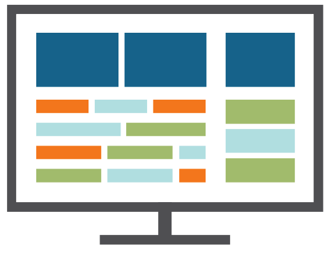
- Use headings and spacing to group related content.
- Use descriptive text for links and avoid generic, meaningless language like “click here.”
- Keep your content well organized and clear.